Platform
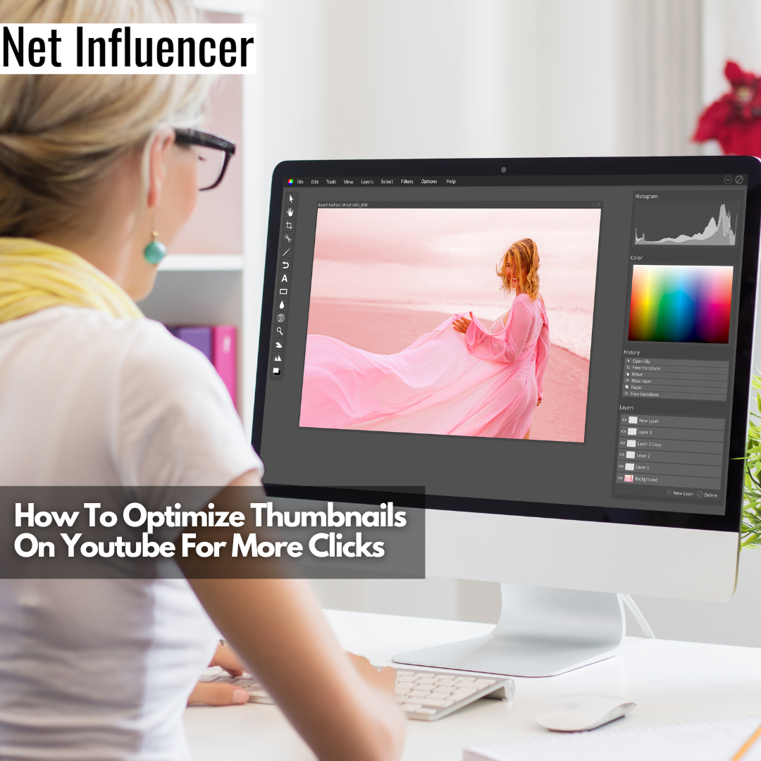
How To Optimize Thumbnails On Youtube For More Clicks
If you’re looking to get more viewers on your YouTube Channel, consider optimizing your thumbnails. Thumbnails are a key marketing tool added by professionals to attract viewers to watch your brand’s videos. By making them personalized, you can ensure that you’ll get more views and that viewers will stay longer on your videos by tapping into their curiosity and interest.
As we continue our journey into understanding the inner workings of social media platforms and to better understand the underlying strategies we can use to help our content stand out better, thumbnails on YouTube are important. These are often overlooked, and yet they are the first interaction potential viewers will have with your content.

Understanding how this can be used effectively as a marketing component and how to optimize thumbnails on YouTube will help attract more viewers and support the channel itself.
WHAT IS A YOUTUBE THUMBNAIL?
Thumbnails on YouTube are the still images that appear as the pictures one sees before viewing a YouTube video. It’s clickable and meant to represent the content one is about to view. You can either leave the thumbnail to be not customized, and at times, this can show a blank screen if there isn’t any content during the first view seconds.
The more tactical approach is to work on being creative with YouTube thumbnails, as this will allow for a customized thumbnail of your choosing, which can help the YouTube content be more accessible to users.
TIPS FOR USING YOUTUBE THUMBNAILS
Now that we understand what Thumbnails on YouTube actually are, why are they so important? They’re just a precursor for the quality content that you’ve produced, so why go the extra mile and spend more time on that image? You’re competing with many different videos and seeking that all too crucial click-through rate (the rate at which people view your thumbnail versus clicking through to watch your content).
- Branding
Youtube is all about creating authentic and unique content. Whether you want to upload other people’s videos simply or generate consistent content about your passion and skill set, you will need some type of branding. Your thumbnail should showcase your branding every time. Whether it’s your brand colors and fonts or just a representation of the content you’re producing, it should be there.
You want to also be consistent and have all your thumbnails on YouTube generally look the same. You can change the title and the wording, but it should be a uniform approach throughout.
- Make Them Attractive
You want your thumbnail to be eye-catching and get people interested. Yes, it’s only an image, but that image is the first impression that easily can lead to click-through rate increases. Use bold text, bright colors, and high contrast resolution so that it actually subconsciously catches the eyes of potential viewers. You want to be inviting yet, at the same time, have the right type of balance so that it doesn’t look overwhelming.
- Avoid Looking Like ‘clickbait’
Have the description be as clear as possible but also as relevant as possible. Clickbait will instantly annoy users and can lead to dislikes on your videos and fewer click-through rates in the long run. Remember you want the user to click on your thumbnails but also watch the video itself. If they simply arrive at the video and leave moments later, then there’s no benefit to you.
In the end, you want to ensure that you’ve developed a professional style and approach to how your thumbnails on YouTube will look. It’s a heavy piece of advertising that is becoming a standard when looking to get more views on your videos.
HOW TO OPTIMIZE THUMBNAILS ON YOUTUBE?
Before optimizing thumbnails on YouTube, first, make the active decision to use a customized Thumbnail for your YouTube video. If not, then YouTube itself will offer a few freeze frames of your video content that are not the best way to market your content or be creative with YouTube thumbnails.

- Image Size
First, understand the optimal size by looking at how to optimize thumbnails on YouTube. Remember, this is an image, not a video, so the best size is 1280 x 720 pixels. This helps to ensure that it looks responsive and uniform on different devices as well.
- Background
Once you understand having the proper aspect ratio, you need to choose a relevant background image for your video. This helps display and showcase what the video content will be about and help convince users to click and watch the YouTube video effectively.
- A travel blogger would use the location in the background.
- A podcast would have the image of the interviewer and interviewee in the foreground
- Other types of content would do well with bright colors that help to build out branding and be attractive for users.
3. Frame Elements to Highlight Features
Once all the elements are placed together, it’s about displaying the composition in the best way possible. Focus on key aspects of the different components and have those items pop out if necessary, whether it’s the text or the background image. Finally, ensure it looks appropriately framed with all the elements looking as if they’re exactly where they need to be.
4. Sync Thumbnails to Videos
Then you want to work on syncing your thumbnails with your videos. That means placing them within the video. This helps with a lot of background algorithms that will help to get your YouTube videos not only on playlists (those recommended videos on the side) but will also help when it comes to appearing at the end of other YouTube videos, known as the video end screens.
5. Promote on Other Social Platforms
A final way to optimize thumbnails on YouTube is to use them outside of it. For example, post them on social media channels, and embed them to your website directly so that there are multiple touchpoints for users to find your content and avoid having to compete with every other YouTube video.
HOW TO MAKE YOUTUBE THUMBNAILS STAND OUT
Now that you know what thumbnails on Youtube are and how to optimize thumbnails on YouTube, let’s take a look at some refining touches that can be done to give your thumbnails on YouTube just the right amount of wow factor.
Tips to make your thumbnail more visible:
- Put The Creator’s Face On The Thumbnail
This leads to a more authentic approach, which is key in content creation. It combines elements of branding and attracting people while at the same time showing who’s going to be on the video, which helps add a visual depth to what your video is going to be about. You’re also able to convey emotion with the face, so you can see what the tone of the content will be, for example, informative or humorous.
- Color is critical
We cannot stress just how important coloring is in your thumbnails on YouTube. Go bright and bold where possible, and don’t be afraid to be expressive. You don’t need to tone it down here; it can help pop out your video amongst everyone else’s.
For example, if you’re doing food videos, consider relevant contrasting colors to make the food look more appetizing. If you’re doing an adventure video, keep the colors cooler and more neutral and combine them in a more natural color frame. The colors help lay a foundation for your content.
- If There’s Action, Show Action
This is especially true for travel vloggers. Use creative YouTube thumbnails with the image of the location, a landmark, or even the local cuisine, and get people interested in where you’re going and why. If you’re doing extreme sports, have it be an action shot of jumping out of a plane or scuba diving in the thumbnail. This visual context easily attracts users to see what the action is all about.
No matter what, don’t be afraid to test. You want to try different thumbnails for YouTube videos and track the results of which one performs better.
ADVANTAGES AND DISADVANTAGES OF YOUTUBE THUMBNAILS
The advantages center around getting more clicks to your content and eventually more people viewing your content. This compounding effect will help your content rank better, which, you guessed it, leads to more viewers and eyes on your content!

Keep in mind that there’s slight technical know-how when it comes to thumbnails on YouTube. You’ll have to be well versed in how YouTube works, and you’ll have to create a customized thumbnail for each YouTube video you post. This can lead to additional costs through the hiring of graphic designers. From time to time, the YouTube thumbnail can also experience a bug, so be patient and always test it out before sharing with a larger audience.
WRAP UP
Thumbnails on Youtube are a key marketing tool to attract viewers to your content. They are relatively easy to create, especially when using qualified experts, and with a template for your branding in general, you can quickly produce these highly impactful thumbnails.
Make sure that you’re always thinking of using a customized thumbnail and that the relevant information is always there to inform, attract and grow your branding with each new video content that you’re posting. With this minimal piece of marketing, you’ll quickly see how your content starts to become more optimized and watched. It never hurts to have an experienced professional create the right type of thumbnails on YouTube so that you’re able to focus on developing awesome content fully.
Ready to take your YouTube expertise to the next level?
Check out this article on What is the YouTube Creator Academy?


